Smotrów Design is a global design and technology company. Our commitment
- office@smotrow.com
- Smotrow Signature
- Smotrów Related
- Local time: 7:31 AM
Smotrów Design is a global design and technology company. Our commitment
A practical guide on how to approach law firm photography - from lawyer headshots to AI-generated imagery and technical optimization for the web.

Photography is the first thing a client processes on a law firm’s website - before they read a headline, before they notice the navigation, before they form a conscious opinion about the firm. The visual layer speaks first. And it speaks fast: within fractions of a second, the visitor absorbs signals about the firm’s professionalism, scale, modernity, and attention to detail. A strong photograph builds trust instantly. A weak one - or worse, a stock image - erodes it just as quickly.
A strong photograph builds trust instantly.
Yet law firm photography is one of the most neglected aspects of legal website design. Firms invest in content strategy, in site architecture, in SEO - and then populate the pages with outdated headshots, generic stock imagery, or no photographs at all. As we noted in our article on five things that actually matter in law firm website design, the right visual impression can partially compensate for a lack of obvious expertise signals. The reverse is equally true: poor photography can undermine even the strongest practice.
Poor photography can undermine even the strongest practice.
This article continues our series on designing websites for law firms, which includes guides on homepage content, attorney profile pages, practice area pages, contact page design, website SEO, CRM integration, website technology, lead generation, publications and insights, GEO and AI visibility, how to choose a website design agency, international law firm websites, the About page, and [when to approach a redesign (https://smotrow.com/insights/law-firm-website-redesign-when-to-do-it-and-how-to-approach-it). Here, we focus on the visual layer: what types of photography a law firm website needs, how to execute them well, and how to make them work within the design system.
When a potential client lands on a law firm’s website, they are not evaluating content - they are evaluating feeling. Does this firm look serious? Modern? Established? Trustworthy? These judgments happen before the conscious mind engages, and they are driven almost entirely by visual signals: typography, spacing, color - and photography. As we discussed in our article on law firm website content, the homepage has two to three seconds to shape an impression. Photography is the single most powerful tool in that window.
A firm with polished, consistent attorney portraits immediately signals professionalism. A firm with mismatched headshots - some from a studio, some from a phone, some from five years ago - signals disorganization. A firm with stock photography signals that it did not invest in its own image. And a firm with no photography at all signals that it is hiding something, or simply does not care enough.
The stakes are higher for law firms than for most industries. Legal services are built on trust and reputation. A client choosing a lawyer is making a high-stakes, often emotional decision. They want to see real people, real offices, real evidence that the firm exists and operates at the level it claims. Photography is the most direct way to provide that evidence.
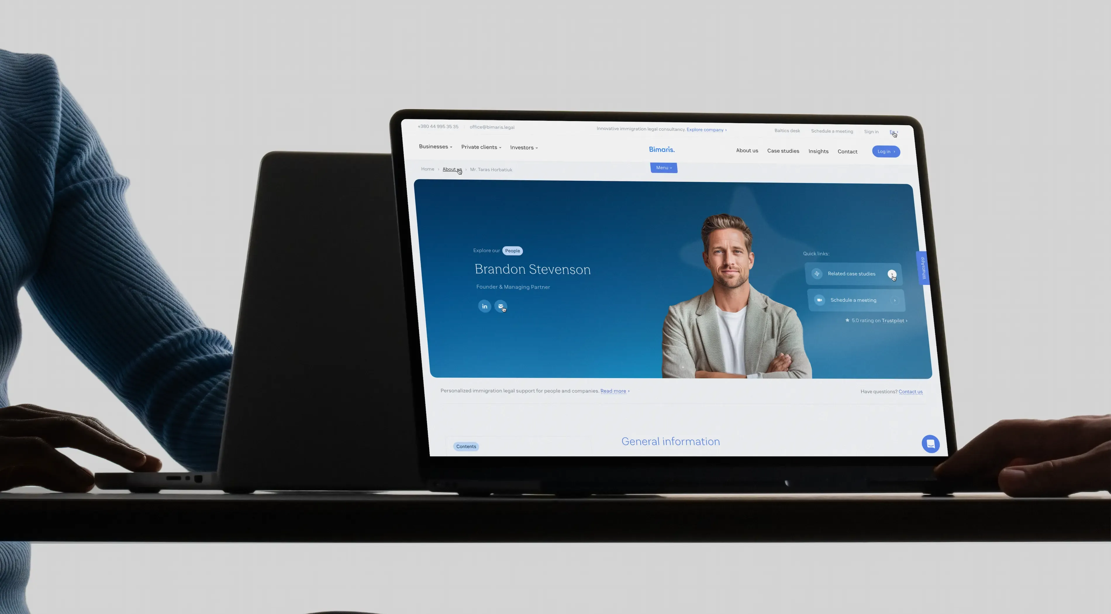
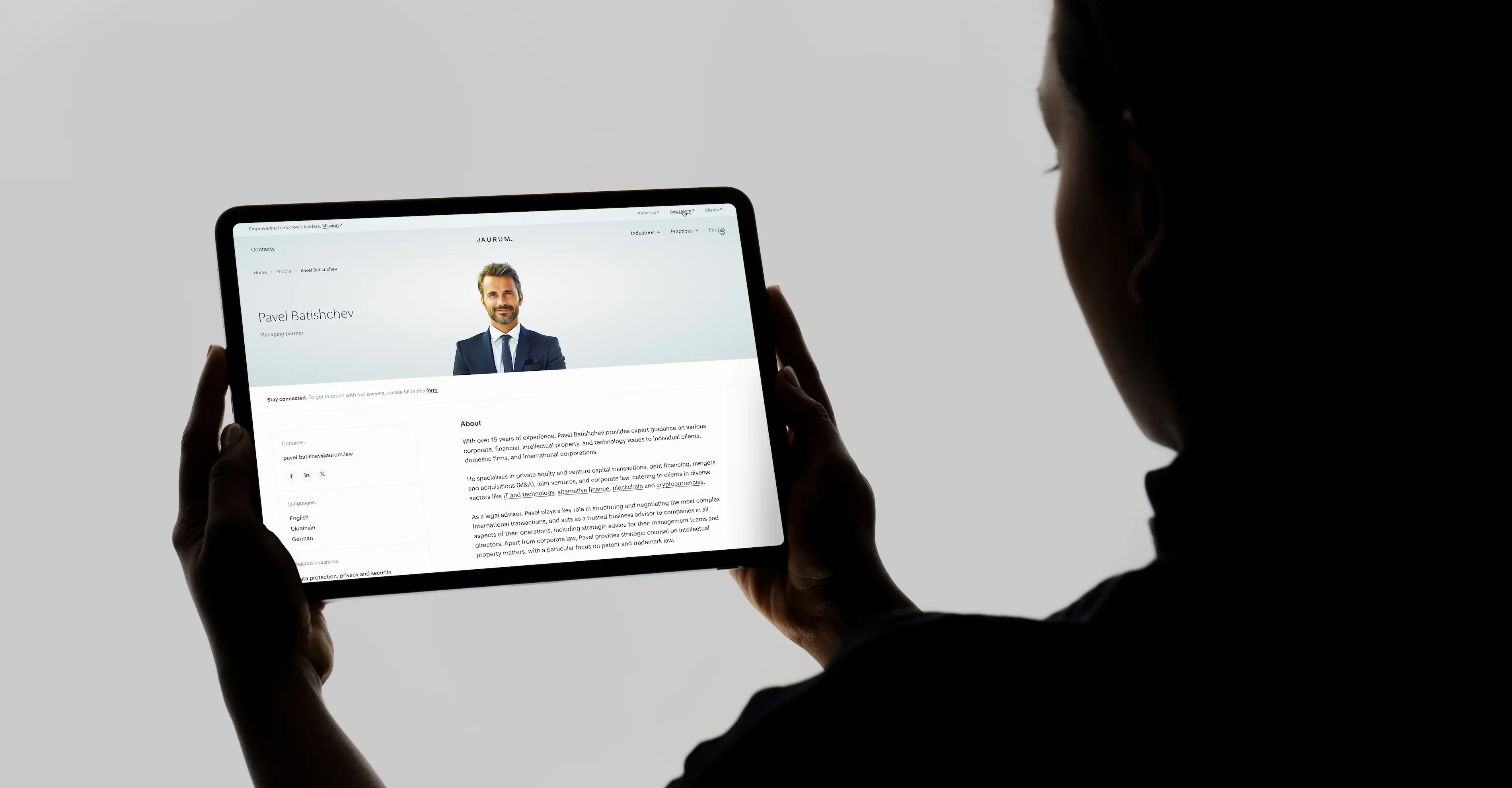
Attorney headshots are the most important category of law firm photography. They appear on the attorney profile page (the second most visited page on any law firm website), on the homepage team block, on practice area pages, alongside publications, and across external platforms like LinkedIn, legal directories, and conference materials. A single headshot does more work than almost any other visual asset on the site.
Most law firm headshot advice focuses on the photoshoot itself: what to wear, how to pose, what expression to use. This advice is not wrong, but it misses the bigger picture. A headshot that looks beautiful as a standalone portrait may not work within the design system of a website. The background may clash with the site’s color palette. The crop may not fit the card layout on the team page. The resolution may be insufficient for retina displays but unnecessarily heavy for mobile.
We approach attorney headshots as a design component, not an isolated photograph. Before the photoshoot, we define how the images will be used across the website: as square cards on the homepage (requiring a tight head-and-shoulders crop), as larger portraits on profile pages (allowing more context), as small thumbnails on practice area pages (requiring clear faces even at 80px), and as circular or rounded avatars alongside publications.
This means the photoshoot must produce images with enough resolution and framing flexibility to support all these contexts. We recommend shooting slightly wider than the final crop, on a clean background, with consistent lighting across all subjects.
We recommend shooting slightly wider than the final crop, on a clean background, with consistent lighting across all subjects.
Photographers often recommend interesting or contextual backgrounds - a bookshelf, an office window, a city skyline. For standalone portraits or print materials, this can work. For a website, it almost always creates problems.
A neutral background - white, light grey, or a solid color aligned with the firm’s brand palette - gives maximum flexibility. It allows the image to be cropped to any aspect ratio, placed on any page layout, and integrated with any design direction. A photo taken against a dark wood bookshelf looks fine on one page but clashes with a light-themed practice area section. A photo with a window behind the subject creates inconsistent lighting when placed next to a studio portrait of a colleague.
The simplest approach is the most reliable: a professional studio setup with a clean, solid background. The personality and authority should come from the subject - their expression, posture, and attire - not from the backdrop.
The simplest approach is the most reliable: a professional studio setup with a clean, solid background.
The legal profession is inherently conservative, and attorney headshots should reflect this. A well-fitted suit, minimal accessories, and grooming that communicates precision - these details matter because clients read them as signals of professionalism before they process anything else.
For international corporate firms, formal business attire is the standard. For boutique firms or those serving creative industries, a slightly less formal approach may be appropriate - but this should be a deliberate choice aligned with the firm’s brand, not a default to casual. The rule of thumb: dress for the client you want to attract.
Consistency within the firm matters as much as individual quality. If three partners wear dark suits and one wears a casual blazer with no tie, the visual dissonance on the team page undermines the impression of a unified firm. Establish wardrobe guidelines before the shoot and communicate them clearly to every participant.
Retouching is necessary - but restraint is essential. Minor corrections (evening out skin tone, removing a temporary blemish, adjusting white balance) improve the image. Heavy retouching (smoothing skin to the point of artificiality, reshaping features, dramatic color grading) destroys trust.
As we noted in our article on what every attorney profile page should include, we advise against using AI tools for photo retouching. Regardless of how advanced the technology has become, the result still looks artificial - and that is precisely the signal that undermines the credibility a professional headshot is supposed to build. Clients want to see real people.
Clients want to see real people.
For a boutique firm with five to eight attorneys, consistency is straightforward: one photographer, one session, one background, one style. Everyone is photographed on the same day under the same conditions, and the results are inherently cohesive.
For larger firms - those with thirty, fifty, or a hundred professionals across multiple offices - consistency becomes an architectural challenge. Partners hired ten years ago have headshots from a different era. Associates who joined last month may not have been photographed yet. The London office used one photographer; the Kyiv office used another. The result: a team page that looks like a collage rather than a coherent visual system.
The solution is to establish a photographic standard - a set of specifications that any photographer in any city can follow to produce results that match: background color and texture (specify the exact shade or provide a physical reference), lighting setup (flat, even lighting from a defined angle), framing (head-and-shoulders, centered, consistent distance from subject), file specifications (resolution, color profile, file format). With these specifications documented, new hires can be photographed locally and the result will integrate seamlessly with the existing team. For international firms with offices across multiple countries, this photographic standard becomes even more critical - it is the only way to ensure visual unity across geographically distributed teams.
A website redesign is often the ideal moment to invest in a full firm-wide photoshoot. It resets the visual baseline: every attorney photographed under the same conditions, in the same style, at the same time. The result is a team page that communicates unity and professionalism from the first glance.
Handshakes in conference rooms. A group of smiling professionals around a table. A gavel resting on a stack of leather-bound books. A city skyline at sunset. These images appear on thousands of law firm websites around the world - and every one of them communicates the same thing: this firm did not invest in its own visual identity.
The problem with stock photography is not that it looks bad. Modern stock libraries offer technically polished, well-lit images. The problem is recognition. Clients have seen these images before - on other law firms’ websites, on corporate brochures, on LinkedIn ads. The moment a visitor recognizes a stock photo, the spell of professionalism breaks. The website stops feeling like a representation of a specific firm and starts feeling like a template.
For corporate law firms, where every client interaction shapes perception, this is unacceptable. As we discussed throughout our series on law firm website design, the principle of professional calm - restrained confidence, deliberate composition, attention to detail - requires authenticity. Stock photography is, by definition, the opposite of authentic.
If custom photography is not yet available, a clean background with strong typography is better than a borrowed image. No photograph is better than a photograph that belongs to everyone.
AI image generation tools have matured significantly, and for certain applications on a law firm website, they offer a practical alternative to both stock photography and expensive custom shoots. The key is knowing where the boundary lies.
Abstract visuals and backgrounds - geometric patterns, textured surfaces, atmospheric gradients - can be generated by AI and refined through post-production to create unique brand assets. These work well as hero section backgrounds, section dividers, or decorative elements that reinforce the firm’s visual identity without depicting people or specific places. The result is a visual that belongs exclusively to the firm, is consistent with the brand, and cannot be found on any other website.
Attorney portraits. Full stop. AI-generated faces, regardless of how realistic they appear, carry an uncanny quality that erodes trust at the subconscious level. A potential client looking at a lawyer’s profile photo needs to see a real person - someone they might meet in a conference room next week. An AI-generated face cannot provide that assurance.
Similarly, AI-generated office interiors and team scenes lack the specificity that makes photography credible. A real photograph of the firm’s reception area communicates: this is where we work. An AI-generated interior communicates: this is what we wish we looked like. Clients who visit the office will notice the difference.
The practical rule: use AI for abstract, non-representational visuals. Use real photography for anything that involves people or real spaces.
Use AI for abstract, non-representational visuals.
Beyond attorney headshots, a law firm website benefits from environmental photography: the office itself, meeting rooms, building exteriors, and the cities where the firm operates. These images serve a specific function - they ground the firm in physical reality and communicate permanence.
For firms with a distinctive, well-designed office space, architectural photography can be a powerful asset. A clean, modern reception area or a conference room with a city view communicates scale and investment. These images work particularly well in the hero section of the homepage, on the About page, and on the contact page.
The photoshoot should focus on spaces, not people in spaces. Candid shots of lawyers working in meeting rooms almost always look staged and rarely serve the website well. Clean, unoccupied spaces with attention to light, symmetry, and materials produce images that integrate seamlessly into the design system.
Not every office photographs well, and that is perfectly fine. A standard business center interior with drop ceilings and fluorescent lighting will not enhance the firm’s image - it will diminish it. In these cases, abstract visuals, brand-aligned graphics, or AI-generated backgrounds serve the website better than an honest photograph of an unremarkable space.
The test is simple: would a photo of this space make a client more or less confident in the firm? If the answer is less — or neutral - skip it.
Photography does not exist in isolation on a website. Each image must be designed for its specific context - the page it appears on, the layout it sits within, the device it is viewed on. Here is how law firm images function across the key pages we have covered in this series.
As we described in our guide to homepage content, the homepage features a hero visual, a team preview block (two to four partners), and potentially a client logos section. The hero image needs to work at full viewport width on desktop and adapt gracefully to mobile. Attorney photos in the team block appear as small cards - typically 200–300px wide - meaning the headshot must be clear and recognizable even at reduced size. This requires a tight crop focused on the face, with minimal background.
The attorney profile page is where the headshot does its most important work. Here, the image is displayed larger - typically 300–500px wide on desktop - and the visitor spends more time looking at it. The portrait should feel confident and approachable, with enough resolution to look sharp on retina displays (serve at 2x the display size).
On practice area pages, attorney photos appear as a team grid - three to six lawyers associated with the practice. These are typically smaller than on the profile page, displayed in a row. Consistency is critical here: if one attorney has a studio portrait on a white background and another has a casual shot from a conference, the visual dissonance undermines the credibility of the entire practice.
On mobile devices, images are compressed further. A headshot that is 400px wide on desktop may be displayed at 80–120px on a mobile team grid. At this scale, only the face matters - the background, clothing details, and body language become invisible. This is another reason why tight, clean headshots with neutral backgrounds outperform contextual or environmental portraits.
Page speed is directly affected by image weight. Attorney headshots should be served in WebP format, with lazy loading for all images below the first screen. A practice area page with six unoptimized JPEG headshots at 2MB each will take seconds to load on mobile - and every second costs visitors.
Photography is only as effective as its implementation. Beautiful images that are poorly optimized, incorrectly sized, or missing metadata underperform both in user experience and in search visibility.
WebP is the standard for modern web delivery. It offers significantly smaller file sizes than JPEG at comparable quality. For browsers that do not support WebP (increasingly rare), JPEG serves as a fallback. PNG should be reserved for images that require transparency, such as logos or icons - not for photographs.
Every image on the site should be served at the exact dimensions required by the layout - not larger. A headshot displayed at 300px wide does not need to be served as a 3000px file. For retina displays, serve at 2x the display size (a 300px display slot requires a 600px image). This balances sharpness with file weight.
For hero images and full-width backgrounds, target 200–400 KB after compression. For headshots and content images, target 30–100 KB. Test with Google PageSpeed Insights and adjust compression levels accordingly.
Every image on a law firm website should include descriptive alt text. For attorney headshots: “[Name], [Title] at [Firm Name]” - for example, “Anna Kovalenko, Partner at [Firm Name].” For office photography: “[Firm Name] office in Kyiv” or “Conference room at [Firm Name] London office.” Alt text serves both accessibility (screen readers) and SEO (Google reads alt text to understand image content).
File names should be descriptive: “anna-kovalenko-partner.webp” rather than “IMG_4521.webp.” This is a minor SEO signal but contributes to overall page quality.
Image optimization is part of a broader technical SEO discipline that includes page speed, Core Web Vitals, and structured data. For a complete overview of how technical decisions affect search visibility, see our guide on law firm website SEO.
All images below the first screen should use lazy loading - meaning they are loaded only when the visitor scrolls to them. This dramatically improves initial page load time, which directly affects both user experience and Google’s Core Web Vitals metrics. The hero image and any above-the-fold content should load immediately; everything else can be deferred.
Photography is not a one-time investment. It requires periodic updates to remain effective.
A full firm-wide photoshoot should be considered every three to five years, or whenever the firm undergoes a website redesign. A redesign is the natural moment to reset the visual baseline - new design, new photography, everything aligned.
Individual headshots should be updated when an attorney’s appearance has changed significantly, when they are promoted (a senior associate who becomes a partner should look like a partner), or when their existing photo is visually inconsistent with the rest of the team (different style, background, or quality).
Environmental and office photography should be updated when the firm moves to a new office, completes a significant renovation, or opens a new location. Outdated office photos are worse than no office photos — a visitor who sees a photo of an office that no longer exists loses trust.
A practical rule: review all photography on the website once a year. If more than 20% of the images feel outdated, inconsistent, or misaligned with the current brand — it is time to invest.
Understanding what undermines trust is as important as knowing what builds it.
Five attorneys photographed in a studio with white backgrounds, two from a conference with blurry backgrounds, and one from a vacation cropped into a headshot. This is the visual equivalent of showing up to a client meeting with mismatched shoes. It communicates that the firm does not pay attention to detail - the last impression a law firm wants to create.
Clients can sense artificiality, even when they cannot pinpoint it. An over-retouched headshot where the skin looks too smooth, the eyes too bright, the overall image too “perfect” creates a subconscious discomfort. AI-generated faces amplify this effect. In a profession built on personal trust, visual authenticity is non-negotiable.
We have made this case throughout the article, but it bears repeating: stock images on a law firm website communicate that the firm chose convenience over authenticity. Every stock handshake, every generic skyline, every staged boardroom scene tells the visitor that they are looking at a template, not a firm.
A 5MB hero image that takes four seconds to load on mobile is not impressive - it is a liability. Image optimization is not optional. It is part of the photography workflow: shoot, retouch, resize, compress, implement with lazy loading. Skipping any of these steps degrades the user experience.
Some firms, wary of stock imagery and unable to invest in custom photography, remove images entirely. This is better than bad stock photography, but it leaves the website feeling incomplete. As we discussed in our guide to homepage content, a clean background with strong typography can carry a page - but it should be a deliberate design choice, not a compromise born from neglect. If custom photography is not yet possible, invest in abstract brand visuals (AI-generated or designer-created) to provide visual texture while maintaining authenticity.
Law firm photography is not a peripheral concern. It is a core component of the website’s ability to build trust, communicate professionalism, and support the firm’s positioning. Every visual on the site — from attorney headshots to office interiors to abstract brand elements — should be intentional, consistent, and optimized for the web. The principle of professional calm that runs through our entire series on law firm website design applies to photography with full force: restrained, authentic, and deliberate. No borrowed images. No artificial faces. No visual noise. Just real people, real spaces, and real attention to detail.
This article is part of our series on designing websites for law firms. For guidance on specific pages and elements, explore our guides on homepage content, attorney profile pages, practice area pages, contact page design, CRM integration, and when to approach a redesign. For a broader perspective, start with five key elements of a law firm website.


